


Your website looks perfect on your desktop. Then someone opens it on their phone and everything falls apart - text too small, images overflowing, navigation a mess. That visitor isn't going to struggle through it. They're going to your competitor instead.
Responsive design solves this by building websites that automatically adjust to any screen size. In this post, we'll explain why responsive design is still critical for your business, and how tools like Divi make it achievable without becoming a coding expert.
User Experience Drives Everything
When someone visits your site on their phone, they expect it to work. Readable text without zooming. Buttons large enough to tap with a thumb. Navigation that makes sense on a small screen.
If your site doesn't deliver, visitors leave within three seconds. That's not even enough time to read your headline, let alone submit a contact form.
Think about your own behavior - when you land on a non-responsive site while searching for a local business in Sarasota, do you struggle through it? Most people don't. They hit the back button.
SEO Requires It
Google doesn't just prefer mobile-friendly websites - it requires them. The search engine uses mobile-first indexing, which means it primarily judges your site based on how it works on phones. If your mobile experience is broken, your rankings drop across the board.
This matters especially for local businesses. When someone searches for services in Bradenton on their phone, and your site fails Google's mobile-friendly test, you're invisible to a massive portion of your potential customers.
Conversions Depend On It
A responsive website is known to attract visitors and convert them. When someone can easily navigate your site and complete actions like filling out a contact form or making a phone call, they actually do those things.
Non-responsive sites create friction. Every time a visitor has to zoom in to read something or accidentally tap the wrong button because everything's too small, you increase the chance they'll give up. Responsive design removes that friction.
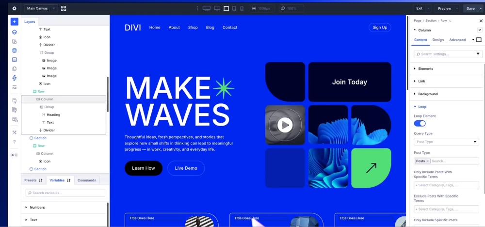
How Divi Makes This Simple
The Divi theme handles responsive design complexity while giving you visual controls to fine-tune how your site looks on different devices. Here's what makes it effective:
Visual Editing Across Devices: Divi's builder lets you switch between desktop, tablet, and mobile views with one click. You see exactly how your site appears on each device and make adjustments visually - no code required!
Device-Specific Controls: Most elements include separate controls for each device type. Want different font sizes on mobile versus desktop? Adjust them independently. Need to hide certain elements on phones? Toggle their visibility. Want different spacing on tablets? Set it specifically for that view.
Built-In Responsiveness: Even without customization, Divi's structure is already responsive. Images scale proportionally, buttons are touch-friendly, and columns stack appropriately on smaller screens. The defaults work well for most situations, and custom controls are there when you need more precision.
You're still making deliberate design decisions about how your site should work on different devices. But you're doing it visually with immediate feedback, not writing and debugging code.
How We Can Help
At Abacus Web Services, we build responsive websites using Divi because it gives us the flexibility to create custom designs while ensuring everything works across all devices. We don't just check that sites "work" on mobile - we actively optimize the experience so visitors can navigate easily and take action without frustration.
Ready to build a website that works beautifully on every device? Contact us at (941) 870-5343 or visit our Divi training page to learn how we can help your business succeed online.


0 Comments